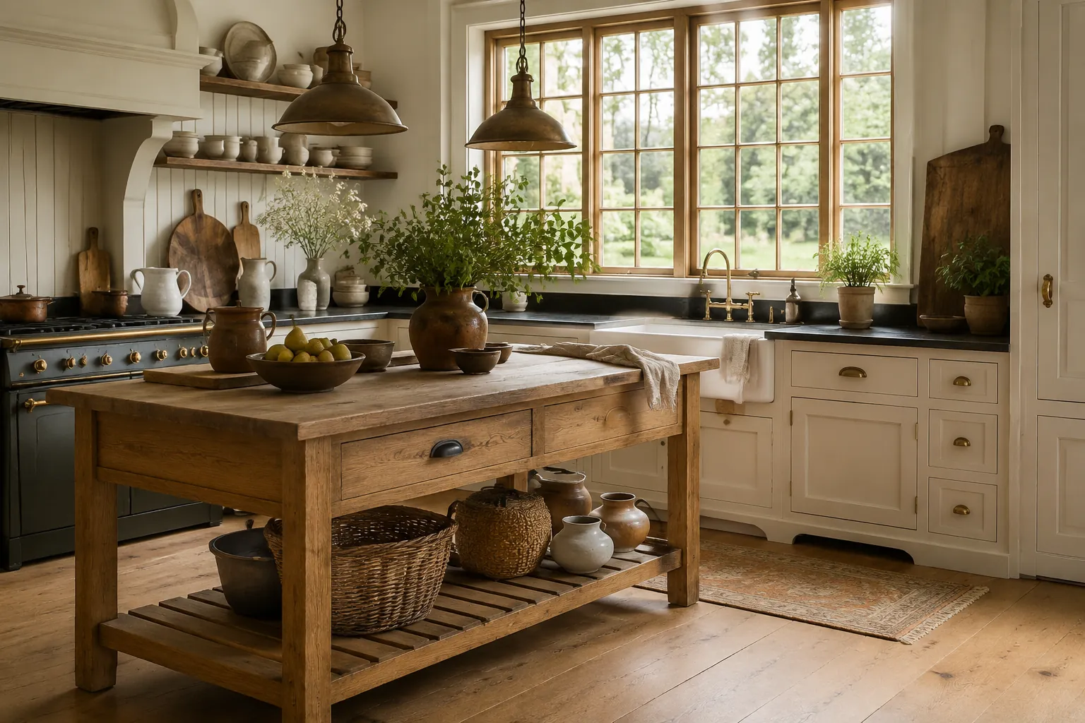
02Open to gatheringRoom for people, not just things
03Better with ageNatural materials with a story
✦
The heart of the house
The best rooms feel collected, not composed overnight.
We imagined Field & Hearth for homeowners who want a room with warmth, rhythm, and a little history in its bones. Nothing too perfect. Nothing chosen simply because it is new.
Painted wood, honest stone, woven texture, and worktables that invite one more chair. Every fictional room study begins with how the household gathers.
Three imagined homes
Rooms with roots.
Original studies in country living, each designed for a different kind of house. These are fictional concepts, not completed client projects.
Fictional room study / Generated imagery
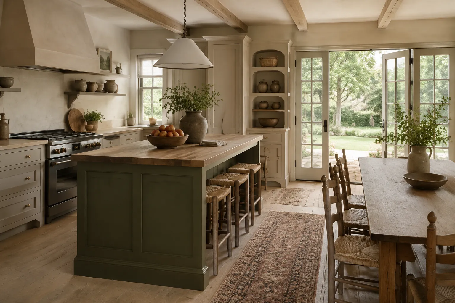
House No. 01
The Garden House
A generous table between supper and the garden.
Mushroom-painted cabinets quiet the working walls while a deep olive island gives the room its center. The table stays close enough for chopping, homework, and lingering after dinner.
Character
Relaxed and gathered
Palette
Olive, oak, warm plaster
Fictional room study / Generated imagery
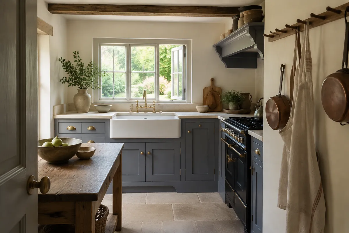
House No. 02
Bluebell Cottage
Small, storied, and wonderfully hardworking.
A compact room keeps its old beams and garden outlook. Dusty blue-gray paint, a fireclay sink, and an oak prep table make every useful inch feel considered rather than crowded.
Character
Quiet and resourceful
Palette
Blue-gray, limestone, copper
Fictional room study / Generated imagery
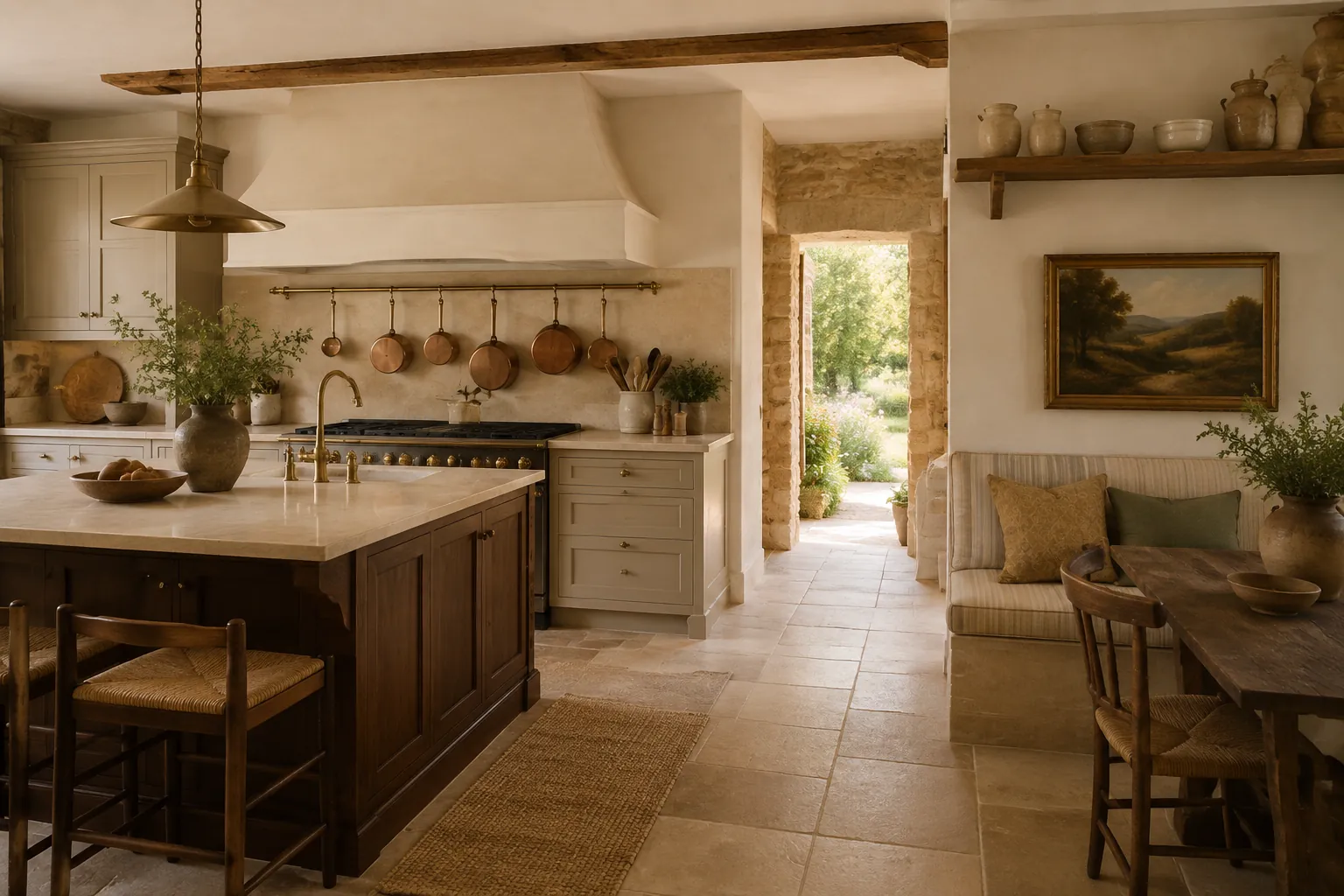
House No. 03
The Old Stone House
New joinery, in conversation with old walls.
Putty-toned cabinetry settles into the stone shell. A walnut island carries the visual weight while unlacquered brass and a breakfast nook soften the room around it.
Character
Grounded and enduring
Palette
Walnut, putty, aged brass
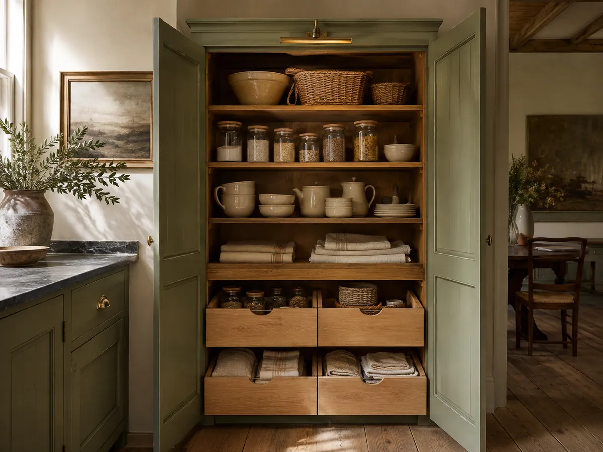
The useful cupboard
A place for everything. Nothing too precious.
A freestanding larder can make a fitted room feel inherited. Doors open wide, oak drawers carry the daily weight, and the things worth seeing stay within reach.
01Breakfast shelf at hand height
02Deep drawers for linens and baking
03Adjustable storage for real routines
Fictional cabinetry detail / Generated imagery
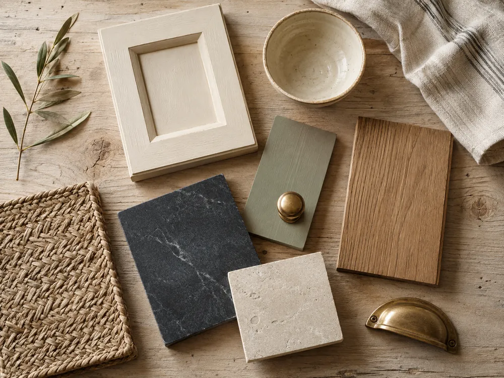
A quieter palette
Materials that remember the touch of a hand.
Select a material to explore how it gives a country kitchen depth without making the room feel decorated.
Concept material table / Generated imagery
At the material table
Warm cream
A soft painted base that follows changing daylight and lets timber, stone, and collected objects carry the room.
From first sketch to Sunday supper
A gentle process for a room that does a great deal.
This fictional process is designed to feel personal and legible, with space to listen before anything is drawn.
01
Listen
Notice the rituals, bottlenecks, keepsakes, and small frustrations already living in the room.
02
Draw
Shape movement, storage, and gathering before choosing the things that sit on the surface.
03
Gather
Bring paint, timber, stone, hardware, and lighting into one calm material story.
04
Build
Sequence the work carefully, keeping decisions visible and the room's original character in view.
05
Settle in
Leave room for cookbooks, flowers, scuffed chairs, and the life that makes a kitchen complete.
A small project guide
What should your next room make easier?
Choose the change that matters most. This interactive sample demonstrates how a remodeling studio could turn an early feeling into a useful first conversation.
Before we add the kettle
A few honest details.
Is Field & Hearth a real remodeling company?
No. Field & Hearth Kitchen Co. is a fictional brand and website concept created by PixelFox.design.
Are these completed client homes?
No. Every house name, room, service, material story, and process on this page is illustrative portfolio content, not client work or documented results.
Where did the photography come from?
The room and material images are original AI-generated concept imagery created specifically for this design direction.
Does the inquiry form send my information?
No. This is a front-end demonstration. The form does not send, save, or submit any information.
Come sit at the table
Tell us about the room you keep imagining.
This fictional inquiry demonstrates a warm, low-pressure first step for a country kitchen remodeling brand.